The CHS Distribution presented as a Radar Chart illustrates the relative contributions of different modules, such as CIEM, CSPM, and CSRM to the organization’s overall risk posture.
At Account Level
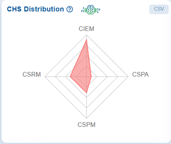
When you hover your cursor over the chart, the data point for the selected tool highlights, displaying its score marked by a red dot and further detailed in a tooltip. Each axis of the chart represents a specific security module, and the plotted points (for example, CIEM with a CHS Score of 4.43) indicates the strength or weakness in that particular area.
By visualizing the modules in this way, the chart highlights which areas contribute the most to potential attack vectors. It helps identify imbalances, weak points, and priority areas for remediation within the Cyber Hygiene framework.
The concentric levels on the chart represent different score ranges, facilitating a quick visual comparison of performance across tools.
Additionally, there is an option to download the data in CSV format.
To gain deeper insight into the factors(misconfigurations, identities, posture anomalies, and missing patches) contributing to bringing down the CHS score of the account, refer to the section: Top 5 Contributors for the decrease in cyber hygiene score in Cloud Cyber Hygiene Score Userguide.
See Also

