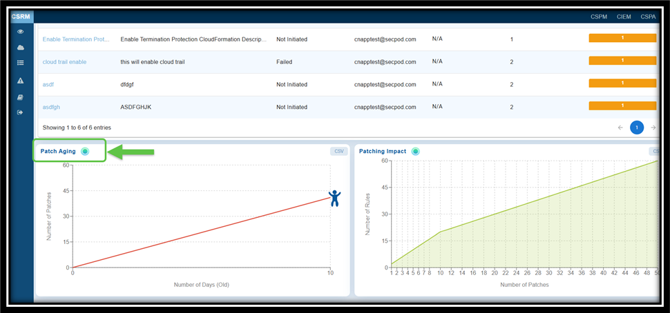
A time-based line plot shows the correlation between the number of pending patches and their age in days, helping teams address older, high-risk vulnerabilities first.
The “Patch Aging” chart visually represents the duration during which patches remain unapplied in an IT environment. It illustrates the relationship between the number of pending patches and the number of days they have been outstanding.
This chart assists organizations in tracking and managing their patch deployment timelines. An upward trend indicates delays in patch deployment, which increases the organization’s exposure to vulnerabilities over an extended period. The creative visual employs characters or icons along the timeline to depict different stages of patch aging, including growth, decline, and subsequent resurgence.
From the Saner CSRM dashboard, navigate straight to the “Patching Aging” block for further analysis.
See Also

