
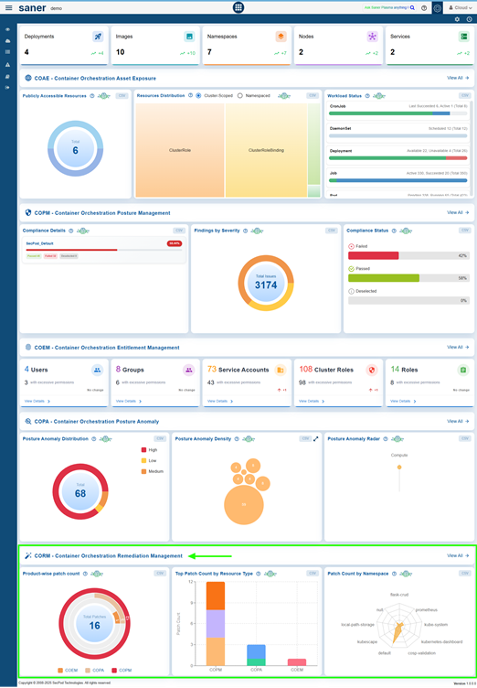
Saner Container Orchestration Remediation Management (CORM) tool presents a centralized platform for automating, monitoring, and optimizing remediation efforts across container orchestration systems. It allows administrators to evaluate the effectiveness of patching initiatives through intuitive charts, helping them prioritize tasks that provide the greatest security impact. By utilizing Patch Aging, older or high-risk vulnerabilities are highlighted to ensure that critical issues are addressed promptly. The Patching Impact analysis enables teams to focus on patches that affect the largest number of systems, maximizing operational efficiency.
Saner CORM also provides real-time oversight of remediation activities by monitoring and analyzing job statuses across multiple tools. Users can identify and prioritize the Top 10 Missing Patches, track the workflow status of remediation tasks, and review patch distribution by resource type. Additionally, insights into patch distribution across various tools allow administrators to assess coverage gaps and optimize patch deployment strategies, ensuring strong security and compliance throughout the infrastructure.

How to Quickly Access the Necessary Tool for Remediation and Begin Patching Tasks?
Choose the Tool and Remediate
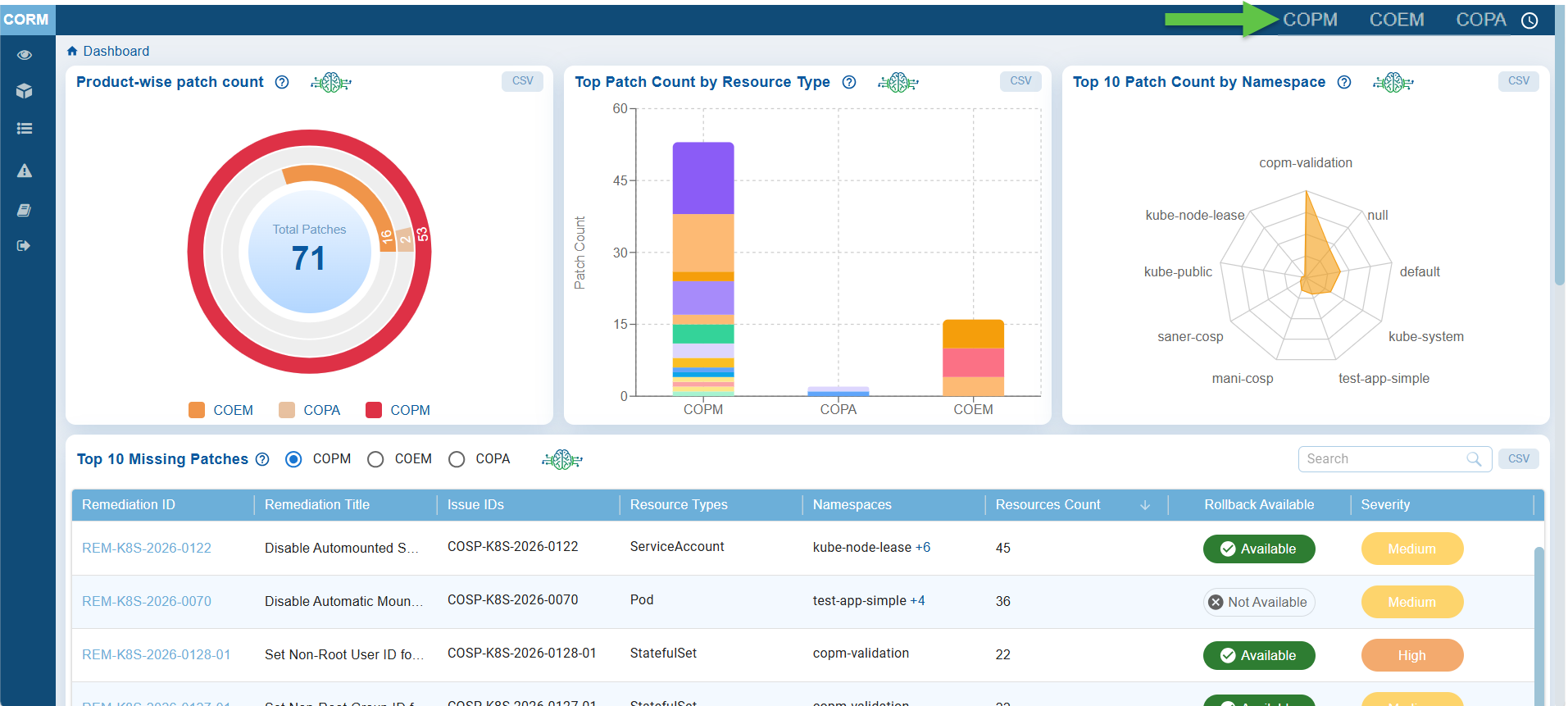
Access the relevant tool: COPM, COEM, or COPA(displayed as links) from the top-right of the dashboard.
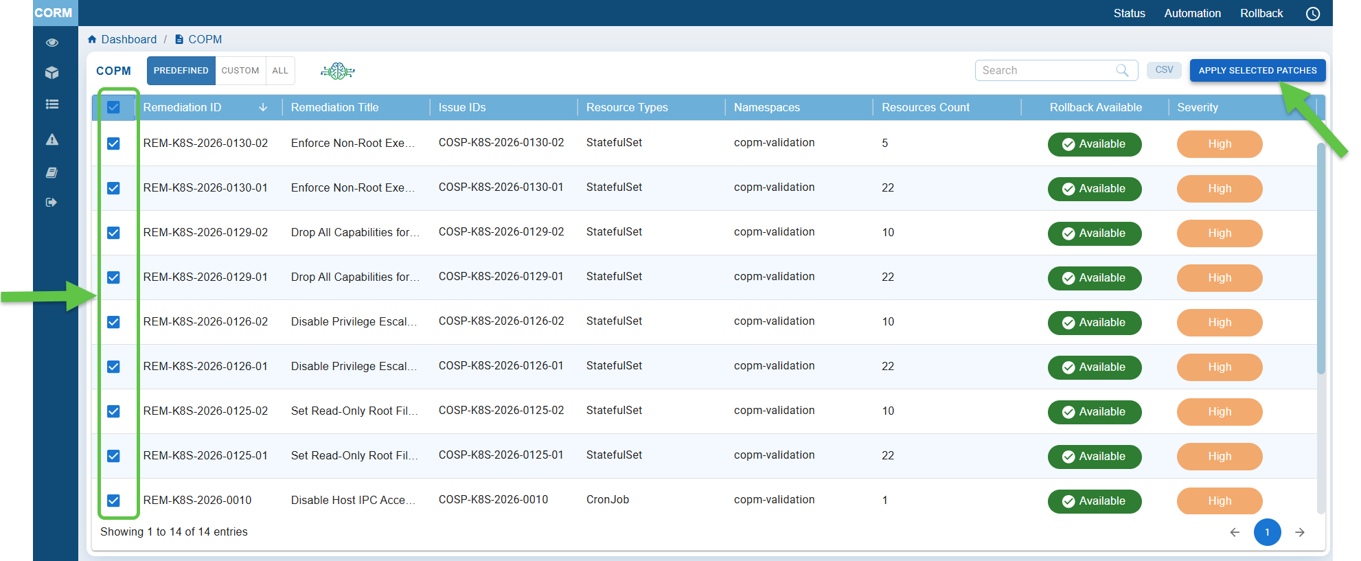
For example, if you select COPM, then the COPM tabular listing opens for you to begin the patching activities.
Follow the link to learn more on: How to Remediate Findings in Saner COSP?
Assess Patch-wise Distribution Across Tools
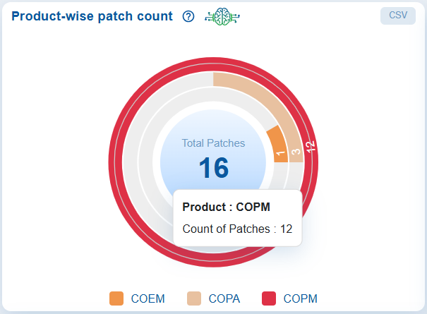
The Product-wise patch count chart allows for quick assessment of patch distribution across various container orchestration tools, namely COPM, COEM, and COPA, each represented by a unique color. Move your cursor over the chart to see the count for each tool. Clicking on the chart opens the CORM tabular listing where you begin the patching activities.
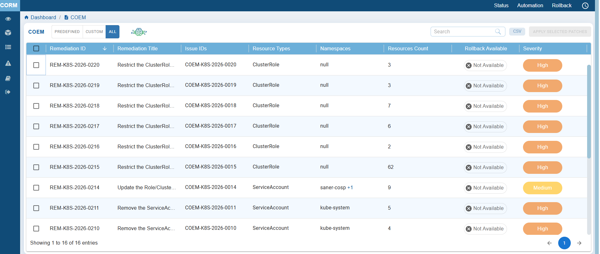
This helps with focused investigation into areas or resources that have not been scanned or are missing patches, allowing users to prioritize patching based on the severity of misconfigurations.
The chart visually displays the patch counts for each tool, using the following color coding: Red for COPM, Gray for COPA, and Orange for COEM. Move your cursor over the different tools in the chart to see the count.
Additionally, you have the option to export detailed data to a CSV file for further analysis or reporting.
View the Top Patch Count by Resource Type
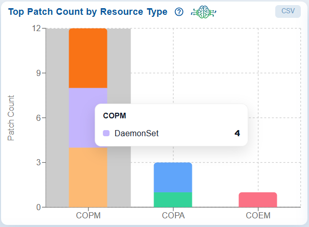
The Top Patch Count by Resource Type dashboard block presents a bar graph that displays the number of patches associated with various resource types. Clicking on the chart opens the CORM tabular listing where you begin the patching activities.
The x-axis represents the different resource types, while the y-axis indicates the corresponding patch counts.
Move your cursor over the bar to see the exact patch count for a specific resource type. Additionally, the data can be exported to a CSV file for further analysis or reporting.
Top 10 Patch Count by Namespace
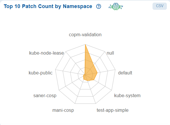
The Top 10 Patch Count by Namespace radar chart in the CORM dashboard provides a clear, namespace-level view of patch distribution across the Kubernetes environment, helping teams quickly identify where remediation efforts are most needed. Each axis represents a namespace, and the distance from the center indicates the number of patches, allowing easy comparison of patch concentration across workloads. In this case the chart illustrates the copm-validation has the highest patch count, signaling a priority for remediation, while others show moderate activity and some namespaces have minimal or no patches.
This visualization allows risk-based prioritization, targeted remediation, and improved visibility, ensuring efficient management of vulnerabilities without impacting the entire cluster.
Identify and Prioritize the Top 10 Missing Patches
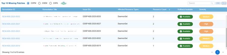
The Top 10 Missing Patches dashboard view allows users to select a tool: COPM, COEM, or COPA, and display the most critical missing patches in a table format.
This table includes essential columns such as Remediation ID with title, Issue ID, the affected resource type with count, if rollback is available or not, and severity that provides a clear overview of high-priority patches that require attention.
This feature helps teams swiftly identify issues, prioritize remediation efforts, and reduce security risks across the environment.
How to Address Missing Patches Via Remediation Tasks?
Click the Remediation ID corresponding to a tool in the Top 10 Missing Patches view. The relevant tabular listing opens for you to begin the patching activities.
The Create Patching Task window opens.
Step1: Select Resources
- From the list of Affected resources, choose the ones you want to remediate
- Use the checkbox to select or deselect resources as needed
- Click Next Step to proceed
Step2: Choose the Remediation Template to Apply
- Select the appropriate option to Review or configure the remediation settings for your patching task.
- Once satisfied with the configuration, click Next Step.
Step3: Schedule Job
- Enter the Task Name and Description in the required fields.
- Use the dropdown to select one of the Remediation schedule:
- Immediate – To apply the remediation immediately
- Select Date & Time – To schedule the remediation for a specific time
- After entering the schedule details, click Next Step.
Step4: Review and Consent
- Admin Users: Get to see the Consent checkbox and directly approve and execute the rollback task
- Regular Users: Consent checkbox appears in disabled mode. Users need to create the Rollback task and the system auto-routes the task to Admin for review and approval
- Carefully review the patching task settings and configurations.
- Provide your consent by selecting the checkbox that confirms settings have been reviewed and aligned with security and operational requirements.
- Click Create Task to finalize and submit the patching task.
Step5: Monitor Remediation Task
- Once created, the patch remediation task appears in the Remediation Status block on the CORM (Container Orchestration Remediation Management) dashboard.
- Use this section to observe the progress and status(such as Pending Approval, Not Initiated, In Progress, Success, Failed, or Completed) of your patch remediation task.
What do the different stages of patch remediation status mean?
— Pending Approval: The remediation job requires approval before execution. This stage ensures that all necessary stakeholders review the job and its impact before proceeding, reducing the risk of unintended consequences.
— Not Initiated: The remediation job is created but not yet started. This status indicates that prerequisites are not met, or the job is scheduled to start at a later time.
— In Progress: The remediation job is currently being executed. The system is actively applying fixes or patches to address the identified vulnerabilities or issues.
— Success: The remediation job has been completed successfully, and all targeted issues have been resolved as expected. No further action is required for this job.
— Failed: The remediation job did not complete due to errors or issues during execution. This status requires investigation to determine the root cause and potentially retry or escalate the job.
— Completed: status typically indicates that the remediation job has completed While “Completed” may overlap with “Success,” it could also include scenarios where the job ended with partial success or manual interventions.
What to do when you encounter an error message when creating a patching task?
You encounter the error message during patch task creation, typically when the target resources are invalid or inactive in the system, remediation template is not configured correctly, or schedule details are incorrectly specified.
As a precursory step, go ahead and revisit the previous steps:
- Select Resources: Ensure the target resources are valid and active in the system
- Rem Template: Verify the selected remediation template is configured correctly
- Schedule Job: Double-check if the scheduling details, such as time, are correctly filled and conflict-free
If the issue still persists, click “Contact Support” in the interface to directly notify SecPod’s support team. Provide them with:
- A detailed description of the steps leading to the error
- Affected resources and templates used
- Logs or screenshots, including this error screen
- Any specific error codes or IDs visible in the logs
Monitor and Analyze Job Status Across Tools
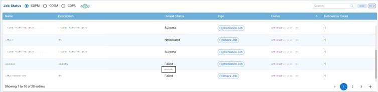
The Job Status dashboard block allows users to select a specific tool, COPM, COEM, or COPA, and view the status of its jobs in a structured table format.
The table includes important columns such as Name, Description, Overall Status, Type, Owner, and Resource Count, providing a clear overview of each job’s details and progress.
This setup enables teams to quickly assess operational health, track ongoing processes, and identify jobs that may require attention or intervention.
You have an option to sort the “Owner”column in both ascending and descending order, use the search box to quickly find specific entries, and export the data in CSV format for reporting purposes. Additionally, you can adjust the number of records shown, making navigation easier.
Use Charts to Evaluate Effectiveness and Prioritize Patches
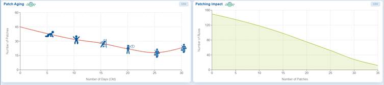
The Patch Aging and Patching Impact charts offer a thorough overview of the effectiveness of patch management.
The Patch Aging chart is a time-based line graph that illustrates the relationship between the number of pending patches and their age in days. This helps teams prioritize addressing older, high-risk findings first. The chart visually indicates how long patches remain unapplied within an IT environment; upward trends suggest delays that increase exposure to security risks. Creative icons along the timeline represent different stages of patch aging, including growth, decline, and resurgence, enabling organizations to manage and track deployment timelines more effectively.
The Patching Impact chart emphasizes the success of remediation efforts by plotting the number of security rules fixed against the number of patches applied. The X-axis represents the number of patches applied, while the Y-axis displays the number of affected rules. Hovering over points on the chart reveals the direct impact of patching on reducing vulnerabilities or misconfigurations, assisting teams in prioritizing patches that provide the highest security benefits.
Prioritize and Address Older or High-Risk Anomalies with Patch Aging
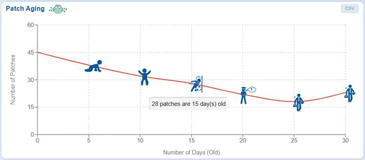
A time-based line plot shows the correlation between the number of pending patches and their age in days, helping teams address older, high-risk findings first.
The Patch Aging chart visually represents the duration during which patches remain unapplied in an IT environment. It illustrates the relationship between the number of pending patches and the number of days they have been outstanding.
This chart assists organizations in tracking and managing their patch deployment timelines. An upward trend indicates delays in patch deployment, which increases the organization’s exposure to risks over an extended period. The creative visual employs characters or icons along the timeline to depict different stages of patch aging, including growth, decline, and subsequent resurgence.
From the Saner CORM dashboard, just go down to the “Patching Aging” block for further analysis.
Prioritize Patches Having Maximum Impact with Patching Impact
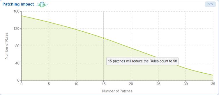
The Patching Impact chart helps you prioritize patches that have the maximum impact, ensuring critical misconfigurations are addressed first. The graph also illustrates the relationship between the number of patches applied and the reduction in the number of rules. X-Axis indicates the number of patches applied Y-axis indicates the number of rules affected.
The point that you highlight by moving your cursor indicates the impact of patching on reducing risks or misconfigurations.
Commonly Asked Questions
How can I identify older, unaddressed vulnerabilities?
The Patch Aging chart provides a time-based visualization of pending patches against their age (in days). It helps identify older, unaddressed vulnerabilities so teams can prioritize remediation efforts effectively.
Is there a way the tool helps to focus on high-risk or aging vulnerabilities?
The Patch Aging chart highlights patches that have remained unapplied for extended periods, and helps teams to focus on high-risk, aging vulnerabilities that increase exposure over time.
What does an upward trend in the Patch Aging chart indicate?
An upward trend signifies delays in patch deployment, leading to prolonged exposure to vulnerabilities and increased security risk.
How are patch lifecycle stages represented in the Patch Aging chart?
The chart uses visual indicators (icons/characters) along the timeline to represent stages such as growth, decline, and resurgence of pending patches.
How to access the Patch Aging chart?
The chart is available in the “Patch Aging” block within the Saner CORM dashboard for detailed analysis.
What insights does the Patching Impact chart provide?
The Patching Impact chart shows the relationship between the number of patches applied (X-axis) and the number of affected security rules resolved (Y-axis), helping measure remediation effectiveness.
How does the Patching Impact chart assist in prioritization?
It helps identify patches that resolve the highest number of vulnerabilities or misconfigurations, enabling teams to prioritize high-impact patches.
What information is available on hovering over the Patching Impact chart?
Hovering over data points reveals the exact impact of applied patches on reducing risks or misconfigurations.
What is the function of the Job Status dashboard block?
It provides a structured view of job execution status across tools such as COPM, COEM, and COPA.
What details are included in the Job Status table?
The table includes Name, Description, Overall Status, Type, Owner, and Resource Count for each job.
How can users filter or locate specific jobs?
Users can sort by Owner, use the search box for quick lookup, and adjust the number of displayed records.
Can Job Status data be exported?
Yes, the data can be exported in CSV format for reporting and further analysis.
What is the purpose of the Top 10 Missing Patches view?
It highlights the most critical missing patches across selected tools, helping teams quickly identify high-priority vulnerabilities.
What information is displayed in this table?
It includes Patch Name, Description, Severity, Affected Systems, Release Date, and Status.
How does this feature support remediation efforts?
It enables rapid identification and prioritization of critical patches, reducing security risks efficiently.
What does the Workflow Status chart display?
It shows the count and status of remediation workflows categorized as Completed, Failed, and Pending Approval.
How does the Workflow Status chart help operations teams?
It provides a quick overview of remediation progress and helps identify workflows requiring attention.
Can workflow data be exported?
Yes, users can export workflow data to CSV for further analysis and reporting.
What is the Top Patch Count by Resource Type chart?
It is a bar graph showing the number of patches associated with different resource types.
How can users interpret this chart?
The X-axis represents resource types, while the Y-axis shows patch counts, helping identify which resources require more patching attention.
Is detailed data available for this chart?
Yes, users can hover over bars to view exact counts and export the data to CSV.
What does the Product-wise Patch Count chart represent?
It shows the distribution of patches across different tools — COPM, COEM, and COPA.
How are tools differentiated in the chart?
Each tool is represented by a distinct color (e.g., Red for COPM, Gray for COPA, Orange for COEM).
How does this chart support decision-making?
It helps identify gaps in patch coverage across tools, enabling targeted remediation and prioritization.
Can Product-wise patch data be exported?
Yes, detailed data can be exported to CSV for reporting and deeper analysis.
Related Topics
How to Configure Automation Rules for COSP Misconfiguration Remediation?

